Dexter: New Blood Branding
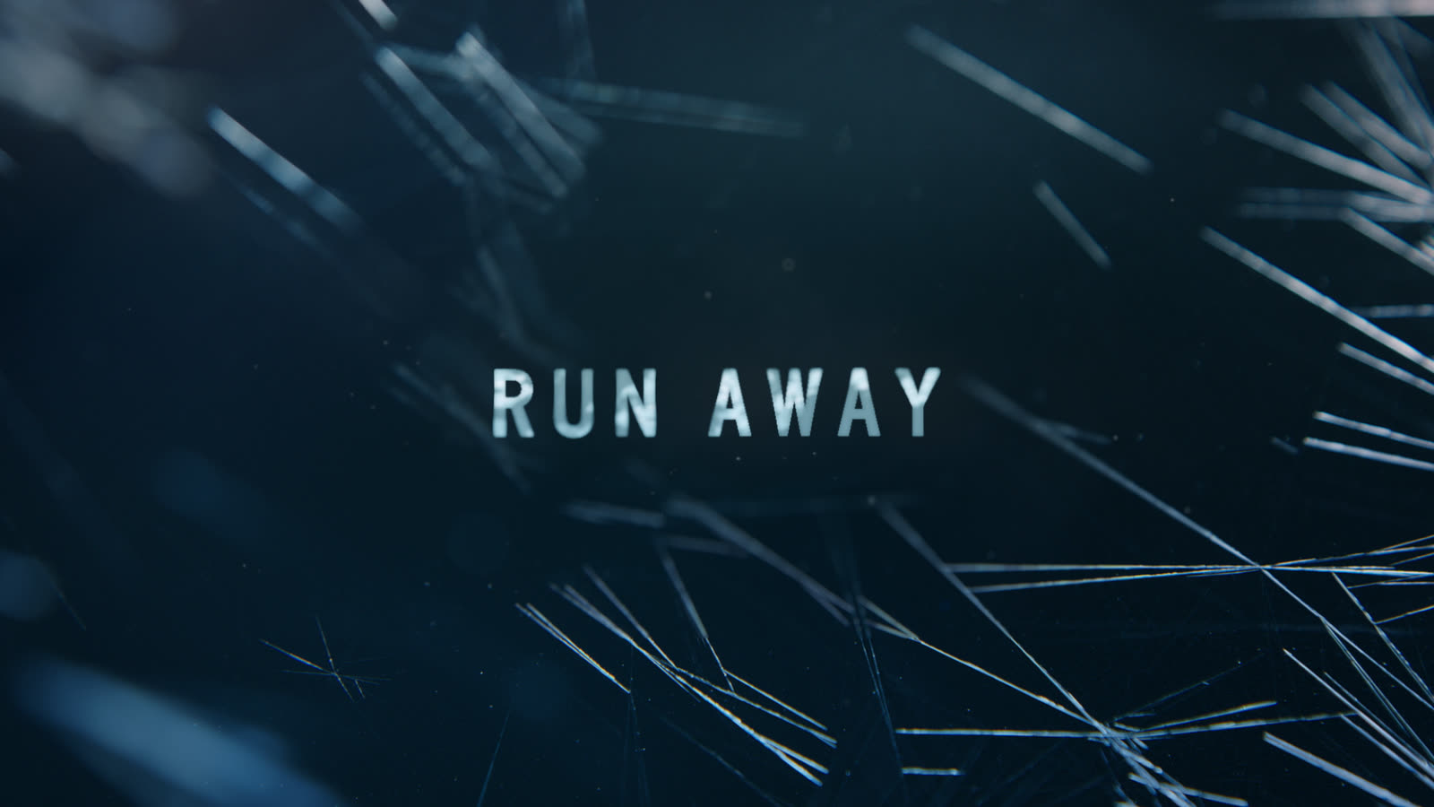
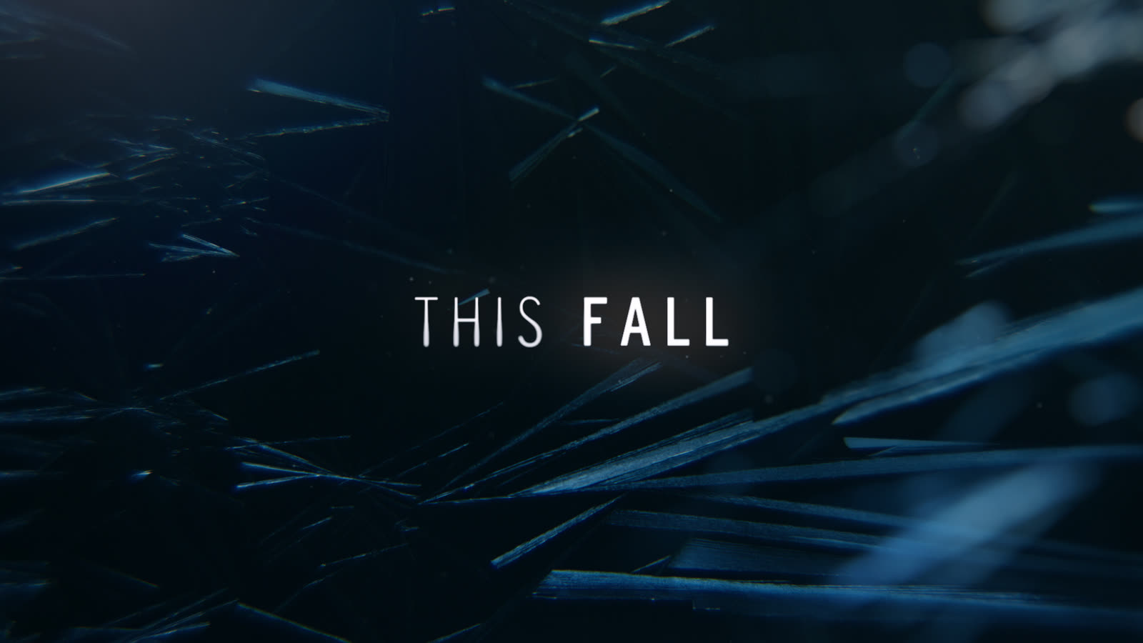
After the original Dexter ended, he disappeared for years, off the boat, out of Miami, gone. New Blood brought him back, and it moved him somewhere Dexter had never been: frigid, frozen upstate New York. Showtime and The Joelsons handed us the brand identity for his return, and the whole thing started with ice.
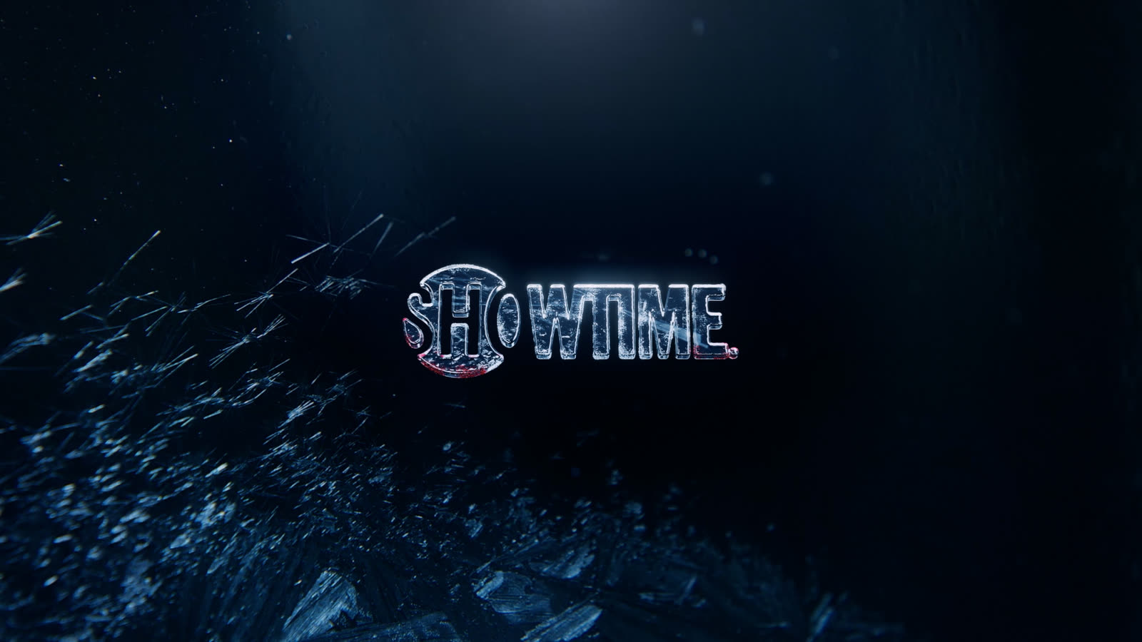
A Logo Made of Ice
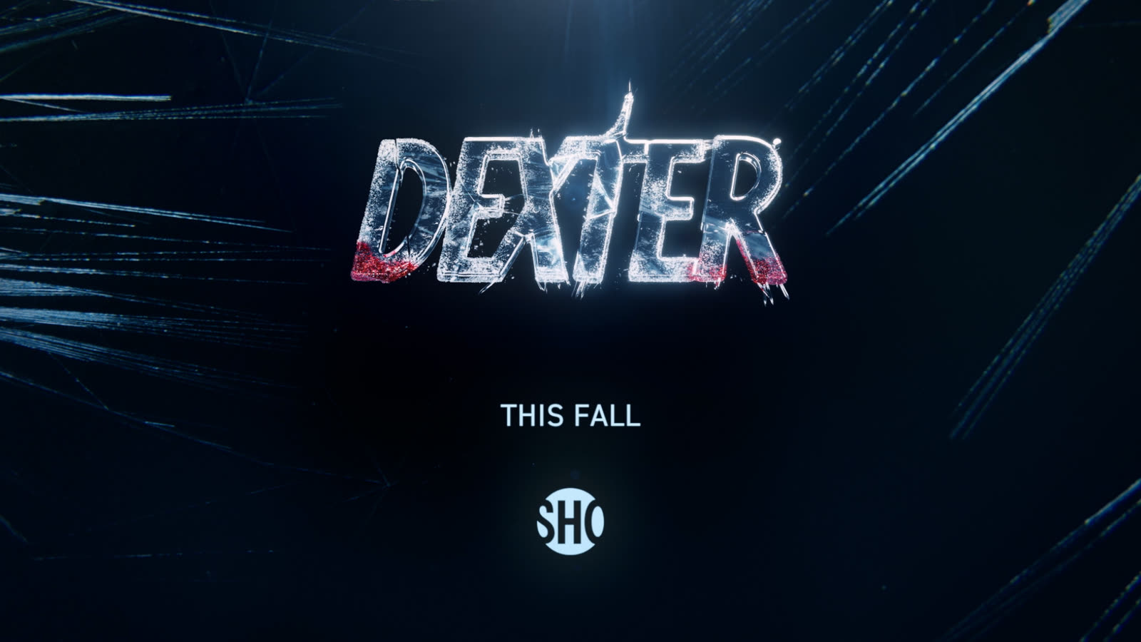
The new setting was the concept. The Joelsons shot macro ice-crystal plates practically and handed them to us, and we built a full ice-driven world for the brand around them, including a Dexter: New Blood logo carved entirely from ice. But it isn’t solid. It’s cracking. Shards splinter off, fractures run through it, because that’s exactly what happens in the story: Dexter’s been frozen up there in hiding, dormant since his sister died, and his son arriving cracks the whole thing open. The ice logo holds the tension of a man about to be thawed out of hibernation, whether he wants it or not. The fracture is the story, told in a single image.
From Brand to Broadcast
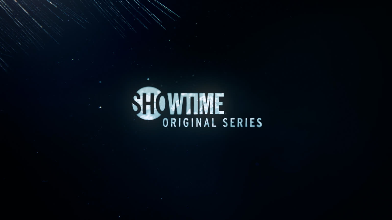
We developed it as a full title-design system Showtime could run across their marketing, the logo, the world, the visual language. It ran at the premiere, turned up as holographic toppers on New York taxicabs, and carried the show’s identity across the campaign. Then it went further than most brand work does: components of the system we built were pushed forward into the actual main titles for the series. The branding didn’t just sell the show. It became part of it.